April 27, 2017
WHY A SWOON-WORTHY INSTA FEED IS SO MUCH MORE THAN VISUALS
We all want to have one of those Instagram feeds that other’s swoon over, right? A beautiful, consistent feed that people take one look at and immediately hit ‘FOLLOW’. And while that is a wonderful goal to have – we need to remember the purpose of a stunning feed is not only to wow our audience, but to really build trust with them, connect with them on a heart level and bring in new clients.
A well curated feed speaks professionalism and should tell the story of your brand while also appealing to your target audience. If your Insta feed is stunning, but there is no deeper WHY behind it, you will be wasting your time. Your followers ( and potential clients ) don’t just want to see beautiful images, but they also want something to connect to, something they can wholeheartedly agree with and be a part of. Your feed needs to be the invitation for them for this.
We want to give you some simple, actionable steps that you can begin to implement RIGHT NOW to get your feed to that next level.
- START WITH YOUR BRAND STORY
Your brand has a certain look and feel – and this should be reflected in your Instagram feed. All the different pieces and touch points of your brand should have the same look and feel, they should be telling the same story. So if you are absolutely winning on your website with that grey, blush and eucalyptus color scheme, but your Instagram feed is full of all black and white images – this won’t speak a consistent brand story to your audience. So, evaluate the defined look and feel of your brand, and then brainstorm ways to incorporate that into your feed.
- KEEP A CONSISTENT EDIT
One way to incorporate that consistency into your feed is by using one or two of the same presets. If you do decide to use two, they should be VERY similar to each other. Granted, even the same edit on different images does not always look the same, but that is what settings like exposure ( brightness ), contrast ( intensity of whites and blacks ) and temperature ( warmer or colder ) are for – making smaller, individual adjustments to help different images with the same edit look consistent. On our own Insta feed, we use only one preset from VSCO, an amazing app that offers several presets, some for free and some for purchasing, and all of the individual adjustments you would need for an Insta photo.
- SEPARATE FOR A GOOD FLOW
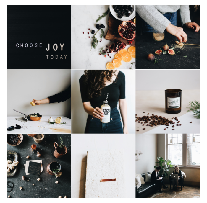
By this I mean, if you have some images that have a lot of of negative space ( like an arm holding a coffee cup against a blank wall ) and also some images that are busier ( like a barista working in action in a coffee shop ), it is best to separate the negative space images from the busier ones. This doesn’t mean that you have to do this every time, but breaking them up will give a better visual flow to your feed. The same goes for lighter images and darker images. Try not to clump them all together, but instead, weave them together throughout your feed. Below is an example of separating both the negative space images from busier ones and also the lighter images from darker ones.
- PLAN AHEAD
Something that is incredibly helpful for me as I pull together our Instagram feed is to plan ahead. Each week, I shoot several images for our feed for the following week. When I have all of the images gathered, I sit down and arrange, rearrange and arrange again all of the photos to organize them in a way that is both aesthetically pleasing and also correlates with our brand’s current projects. Give yourself grace though and don’t strive for perfection as there may be times when two images that might not look the best next to each other just have to be posted next to each other anyway because of an event that is going on or you might not have had the time in that moment to grab a different image. THIS IS OKAY. Plan ahead when you can, but know that some weeks are just different than others and they don’t always look the same.
- CREATE CONTENT THAT CONNECTS
As you shoot photos for your feed, you need to be thinking about your target audience. What do THEY want to see? What are the things that they love and are inspired by – and how can you add those things into your images? The more you understand your target audience, the better engagement you will get because you are not just creating beautiful images anymore, but you are creating content that connects with them on a real, heart level. You are reaching out and saying “Hey, I get you. You are amazing and I would love to have you join me in what I am doing to impact the world.”
As much as we all want stunning feeds, we are all still human and NO ONE’S feed is perfect. Perfection is not the goal of this anyways – the goal is to connect with our target audience, build trust with them in a real way and then have those faithful followers turn into clients who then turn into fellow collaborators and even friends.
Your Instagram feed is a window into all the other aspects of your brand, so of course we want it to be beautiful and have that ‘FOLLOW’ button being clicked a whole lot, but remember that there is a person behind every click, every like and comment. So as you work on transforming your feed, don’t forget WHO you are transforming it for – your tribe, those followers that are going to fall in love with what you do and get behind you because they believe in it and want to be a part of it too!
words by bethany – community creator & photographer
Leave a Reply
Start creating your beautiful brand STORY.
GET STARTED


Thank you so much!
Yes, absolutely! We use the A6 preset and typically use the exposure and contrast adjustments. Depending on the photo, we also occasionally use the highlights and shadows adjustments.