July 18, 2014
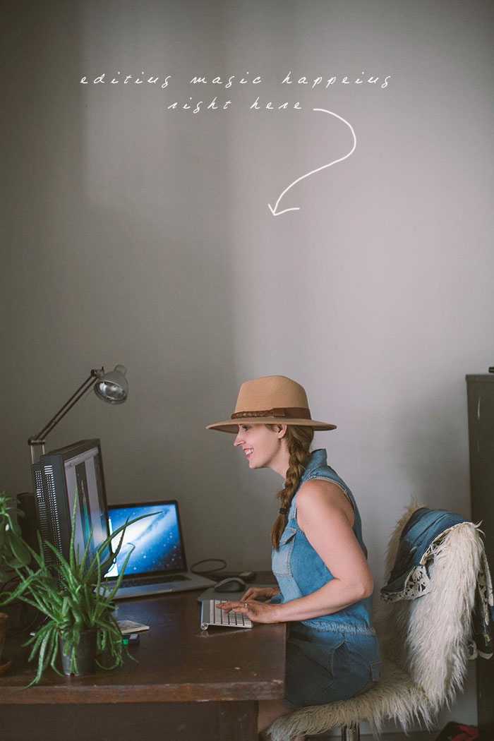
FRIDAY TIP // EDITING THOSE GREENS!
Anna is jumping on here today and sharing one of her magic editing tricks. Here on the East coast, summer time is lots of green, green, green. As a result, we end up with photos that have a WHOLE lot of green in them. Green can be oh so pretty in photos….or it can just be reeeeeally green. It all depends on the shade, friends. This is something we have been chatting a bit about in the studio lately…what shade of green we want to create in our images. Our goal? Green that feels soft, soothing, organic and with a sense of depth…not a loud neon yellow. Who would have thought green could be so specific?! Well…it really does make a difference.
Anna has been working HARD editing this past month…today she is taking a few minutes to tell us how she creates just the green we are looking for.
Hey All! Here are Char Co, summer is a time we all look forward to – spending time with friends at the pool, wearing light summery dresses, drinking homemade lemonade, soaking up the sunshine, and taking trips to the beach with the family. However, in the midst of all the summertime joys, as the photo editor here at Char Co, there is one thing I have always dreaded – editing all those summertime greens.
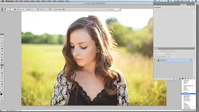
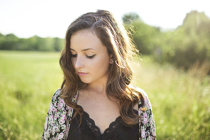
Don’t get me wrong, green is a beautiful color. It reminds us of life and growth and brings the outdoors into our homes. It’s a color I’ve fallen in love with as of late. However, take that same beautiful green, put it in a picture along with bright sunlight, add some Photoshop magic and suddenly you are left with a terrible neon yellow hue to your otherwise gorgeous image. Thankfully, there is a very simple solution. I’ll demonstrate this using an image of our beautiful senior, Maria, that I was editing just this week. After a few steps in Photoshop, you can see the yellow hue is taking over my grass.

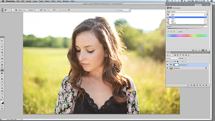
Step 1: Create a hue/saturation layer
Step 2: Switch from Master to Yellows
Step 3: Increase the Hue slightly and bring down the Saturation and Lightness. On this image I chose +8 Hue, -12 Saturation and -12 Lightness. Every picture will vary a little. Be careful not to overdo the Hue (sometimes I don’t change the Hue at all).
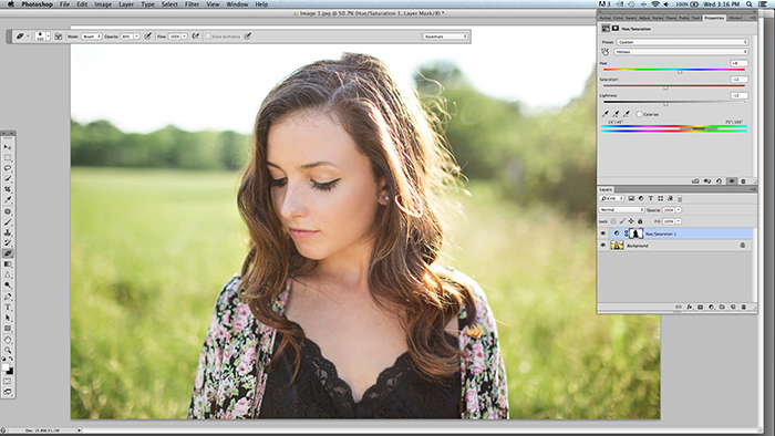
Step 4: Mask off your subjects face and clothing. You don’t want this change to affect them.
So here is the BEFORE:

And here is the AFTER (so much softer and soothing to look at:)
We hope this little editing tip helps you out if those greens were getting the best of you! If you would like to learn more editing tips or photography skills, get in touch and we would love to tell you about our consulting services.
Happy Friday! Xo
Leave a Reply
Start creating your beautiful brand STORY.
GET STARTED
Thank you for this great tip! I love y’alls’ style!